Sub-Glyph Colored CSS Progress Bar
Yeah, I know. There are 1,001 tutorials on CSS-only progress bars. They are mostly the same thing re-explained in a slightly different way. Not in a bad way, either. People learn in different ways and blog posts provide different descriptions that might strike a chord with someone. This post is one more description of one more approach, with one feature I have found lacking in most other tutorials: sub-glyph coloring.
What Is Sub-Glyph Coloring?
Sub-glyph is where a single letter of text has multiple colors. This is best illustrated by example:
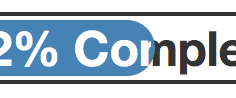
This might seem like a nit-picking detail … ok, it is. Rather than display the text of a progress bar fully in- or out-of-bar my goal was to always have it centered and colored correctly. To do so requires sub-glyph coloring. The end result is like so:

Where this gets interesting is doing this in HTML & CSS given its limited text layout and design options. The other challenge is doing this in such a way that the progress bar can change without I'll effect.
The Markup & CSS
For experienced HTML/CSS people the markup alone will likely explain the approach. I've included the description of my approach afterward as well:
Markup
<div class="progress-bar">
  <div class="label">52% Complete</div>
  <div class="fill">
     <div class="label">52% Complete</div>
  </div>
</div>
CSS
.progress-bar {
    border: 1px solid #333;
    width: 300px;
    height: 14px;
    padding: 1px;
    margin: 0;
    background-color: #fff;
    -webkit-border-radius: 10px;
    -moz-border-radius: 10px;
    border-radius: 10px;
}

.progress-bar .label {
    position: absolute;
    width: 300px;
    text-align: center;
    font-size: 12px;
    height: 14px;
    line-height: 14px;
    font-weight: bold;
    color: #333;
}

.progress-bar .fill {
    position: relative;
    border: 1px solid #4682b4;
    background: #4682b4;
    overflow: hidden;
    height: 12px;
    width: 52%;
    -webkit-border-radius: 10px;
    -moz-border-radius: 10px;
    border-radius: 10px;
}

.progress-bar .fill .label {
  margin-top: -1px;
  color: #fff;
}
Explanation
The key to the sub-glyph rendering is that the label is included twice, with
the two overlapping one another perfectly. One of the labels is "above" the fill
line (z-index speaking) and the other is "below" it. Using overflow: hidden
you achieve the sub-glyph coloring effect. Some of the key CSS aspects are:
- Label
position: absolute– Both labels need to be positioned absolutely to make sure they overlap completely. Note that if you only include this the baseline of the two labels won't align. For that you need … - Label (inside)
margin-top: -1px– To compensate for the 1 pixel border on the progress bar fill. Otherwise the back and front labels won't align correctly.
Everything else should be pretty self-evident from the markup and CSS. If it's not, send me a question on Twitter (@mzsanford) and I'll not only reply but include the conversation at the bottom of the post.
Conclusion
Here it is, in the flesh, for your view-source pleasure: